Formula 1

They’re not going to stop Lewis Hamilton from driving. They need him to race.

Look at the Brooklyn Nets, Kyrie Irving is actively anti-vax and anti-Semitic and they can’t even get him to apologize.

As for fines, it’s an opportunity to do what the Patriots should have done after deflategate. Pay the fine and publicly announce you’re matching a donation to the maximally insulting cause. Children’s science education. The ADL. Greta Thunberg climate fund.

It’s CAR LAUNCH LIVERY REVIEW TIME!!!

Haas! After Rich Energy making the car brown, and Uralkali making the car into a Russian flag, they’ve turned to a (hopefully?) more sensible title sponsor in MoneyGram. Both Haas and MoneyGram have red and white logo, so both pop well against the mostly black and white car.

Thankfully the 2022 regulations made for a aesthetically pleasing car shape, so it’s easy to design flowing lines along that shape.

However I’m not sure why Haas, as the only American team at the moment, doesn’t lean into the stars and stripes flag a bit more. It would be cool for them to make special livery for the three races this year in the USA.

My rating: 6/10

Williams!

So, just last years car again? Sure, if you think that works. Bonus points for the Duracell sponsorship and the Duracell battery on the roll cage air intake, but that side pod looks VERY empty. The light blue line looks like they had a sponsor logo to put there, but then it’s been crossed out.

Disappointing.

My rating: 4/10

Red Bull!

They made another Red Bull F1 car. What did I expect? Exactly this. I’m still not a fan of the side pod air intake shape, but this is a render so it might be showing parts of last year’s car.

The designers have improved on how they incorporate main sponsor logos into the car. Previously Red Bull was the main sponsor, but last year they got Oracle on board, and they are fitting the branding together. I kinda wish they could make the ROKT → Red Bull → Honda text line up better though.

Red Bull will never get high marks from me because, while I think they do a good job, I find their logo inherently ugly.

My rating: 6/10

Alfa Romeo!

They have the bones of a really nice car here. The large blocks of red and black will look great from a distance.

But holy hell, they have a LOT of VERY SMALL sponsors!!! I’ve no idea how they determined what goes where. Maybe a lucky dip, and whichever sticker comes out next is slapped somewhere random on the front and sides?!?!? I guess “Stake” is their new main sponsor, but if I was Stake I’d be unhappy with how the name hardly stands out among the spaghetti of other words and logos.

Also, let’s discuss the wheel covers. Every team gets the same wheel cover part, and can decorate them if they want to. Haas went for a subtle red lining. Williams with some fun chevrons. The Red Bull rendered image shows them left black.

But Alfa Romeo have chosen a design to make them look like car rims, I guess??!? But the standard part has NINE HOLES in them, with eight small holes and one bigger hole. So Alfa have taken something black, painted red shapes on them to look like there are holes, but then the red holes have actual REAL holes in them that show as black?!?!?

Did nobody notice this before the car launched? I know I can be picky, but seriously, they screwed this one up.

If the car had been blocks of red and black, 8/10, but details matter, and that drops my rating to:

5/10

Six more cars to go. I’m hoping for some more interesting designs with better execution, or else this might be a very low scoring year.

2 Likes

Can someone explain why F1 cars have these small wings over their front wheels?

It’s to stop turbulent airflow from the front wheels messing up with the downforce of the car behind. This makes for closer racing and more overtakes. Judging by the 2022 season, it mostly worked.

It’s the same reason for the standard hubcaps, because those stop teams sending airflow over the brakes through the middle of the wheel, which creates more “dirty air” behind. And the rear wing is one single swoopy shape, with fewer sharp angles and pointy bits in the corners, because it doesn’t have corners.

Thanks. I actually found an article explaining it shortly after I asked. I just found it weird because they look like extremely weird fenders that an F1 car obviously doesn’t need, and they appeared to be relatively new as I don’t remember them from when I used to watch F1 as a teenager.

Update!!!

I knocked points off the Williams for the paint job on the side pods. Turns, out, it was the 2023 paint job on a 2022 car. It makes a lot more sense now we have images of the 2023 livery on a 2023 car.

I’m increasing my rating for Williams from 4/10 to 5/10.

Alpha Tauri!!!

Dark blue and white. Nice. Not too cluttered with non-Red Bull sponsors. Red accents. All good!

Did I complain last year about the orange parts of the FleXRoX sponsor? I remember it annoying me then.

My rating 7/10.

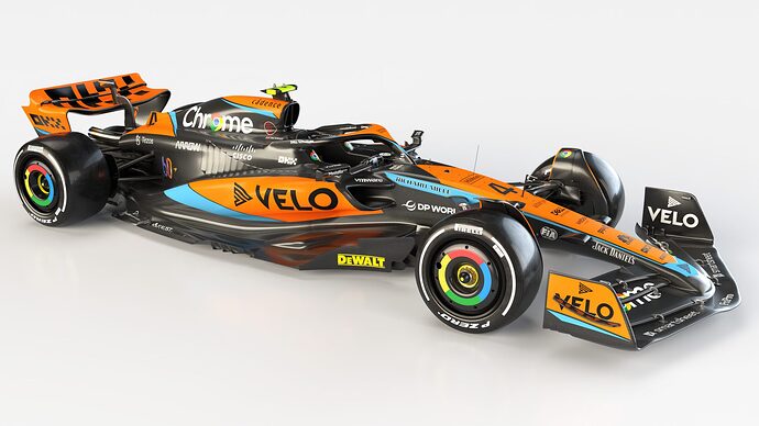
McLaren!!!

I like how a lot of the liveries this year include a lot of black. I understand this is to save weight, as paint weighs more than you think, and leaving the carbon fibre bodywork bare makes a big different.

This is important for a car with too many colours, like the McLaren, as no matter how many more colours you throw on it, the garishness is tempered by the black framing. Thankfully I happen to like the orange and blue, or else this would fall on the wrong side of the garish line.

Honestly, despite complaining about other cars looking too much like last year, this one looks the most similar.

My rating 6/10.

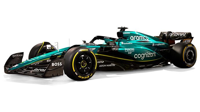
Aston Martin!!!

Another 50% black car, but not garish at all due to a single main colour and one continuous yellow stripe. Lots of sponsor text, but they are arranged more tastefully than the Alfa Romeo sticker canon approach.

I’ve not touched on the aero features of the cars this year, but look at the sweep of these side pods! They saw what Ferrari had last year and said “We can take that further, and our car is going to look even more like a snake!” And they took the underbite pod intake from the Red Bull too. Good luck to them.

My favourite so far, so let’s give it 8/10.

Coming up: Renault, Ferrari and Mercedes.

“You still fail, but by a smaller margin.” :wink:

I agree that the Aston Martin one is the best one so far. That’s a slick looking machine.

Ferrari!!!

Another 50% black car. It’s the same idea as Aston Martin, except red instead of green, but it’s going with the same black front and rear wing. However, there are some parts left bare of paint that I don’t quite understand. The black stripe where the halo joins the front of the car? Why?!?! The black panel on the side with the Ceva sponsorship? Why?!?!?

Otherwise good sponsorship integration, and I like that the nose isn’t as pointy as last year.

My rating: 7/10.

HOWEVER I HAVE CONCERNS with at-a-glance car differentiation. From the front, both Ferrari and Alfa Romeo are very “red and black”. I’m sure it’ll be fine once the season starts and we see the different shades of red side by side, and we get used to “this car has red side pods and this one doesn’t”.


omg seeing the front view of both of these cars just shows how bad the Alfa Romeo’s sponsors look down the nose. I think I’m going to knock another point off my Alfa rating just for that.

1 Like

Mercedes!!!

They had black cars for a few years as part of black lives matter and other inclusivity campaigns, then tried silver again last year.

This year, they’re literally like “Fuck it, we race black cars now!!!” It looks cooler, and there’s weight savings from not needing so much paint. What a power move. Ferrari can claim red, Aston Martin claims green, but Mercedes claim as their own the default colour of carbon fibre, the very building material of Formula 1 cars.

It’s more than just black though. The sponsors being all white (don’t look at the back of the rear wing) and the teal stripe from their main sponsor looks good, but what I’m most impressed with is the use of the third colours.

The above image is Hamilton’s car, and the colour of his number matches the yellow TV camera pylon on top. Every team has one car with a black pylon and one with a yellow pylon, so if you know which is which, you can tell the cars apart.

Normally you have to just remember which car has the yellow pylon. Not with the Mercedes! Check out George Russell’s number… it matches the green wheel nuts!

So it’s way easier to tell the cars apart, with more than just trying to spot the number (difficult at distance or high speed) or see the helmet designs (which can now change colour/design every race). Black and yellow, Hamilton. Black and green, Russell. Done.

Mercedes takes the lead in my ratings, with a strong 9/10.

ALFA ROMEO UPDATE

You know what, I’m going to knock ANOTHER point of the Alfa Romeo design, because Mercedes have shown just how easy it can be to pick out the driver number. I mean, just look at the front of this car again. The number is just one more white squiggle in a whole mess of white squiggles. EPIC FAIL. 3/10.

1 Like

Alpine!!!

Blue and pink but somehow also 50% black. Better sponsor integration than last year, but mostly because the big red MAPFRE logo clashed with the blue and pink, and this year it has gone.

If I’m going to be picky, I’m confused by the orientation on the Alpine name down the front. Why turn it sideways?

And for reasons I don’t understand, they’ve put the driver number on a rounded part of the rear, so side on you can only see the bottom half on the number. Did nobody check this before they put those stickers on the first time?

Decent rating: 6/10.

There’s also a pink version. I’d bump this up to to 7/10 if it was the only livery, but they’ll probably just use it for the first three races again.

Final ratings and ranking…

Top tier:

Mercedes - 9/10
Aston Martin - 8/10

Above average:

Ferrari - 7/10
Alpha Tauri - 7/10

Mid pack:

Red Bull - 6/10
Alpine - 6/10
McLaren - 6/10
Haas - 6/10

Not trying:

Williams - 5/10

Oh come on, please, how can you fuck up such an easy concept?

Alfa Romeo - 3/10

1 Like

No doubt an unscientific poll

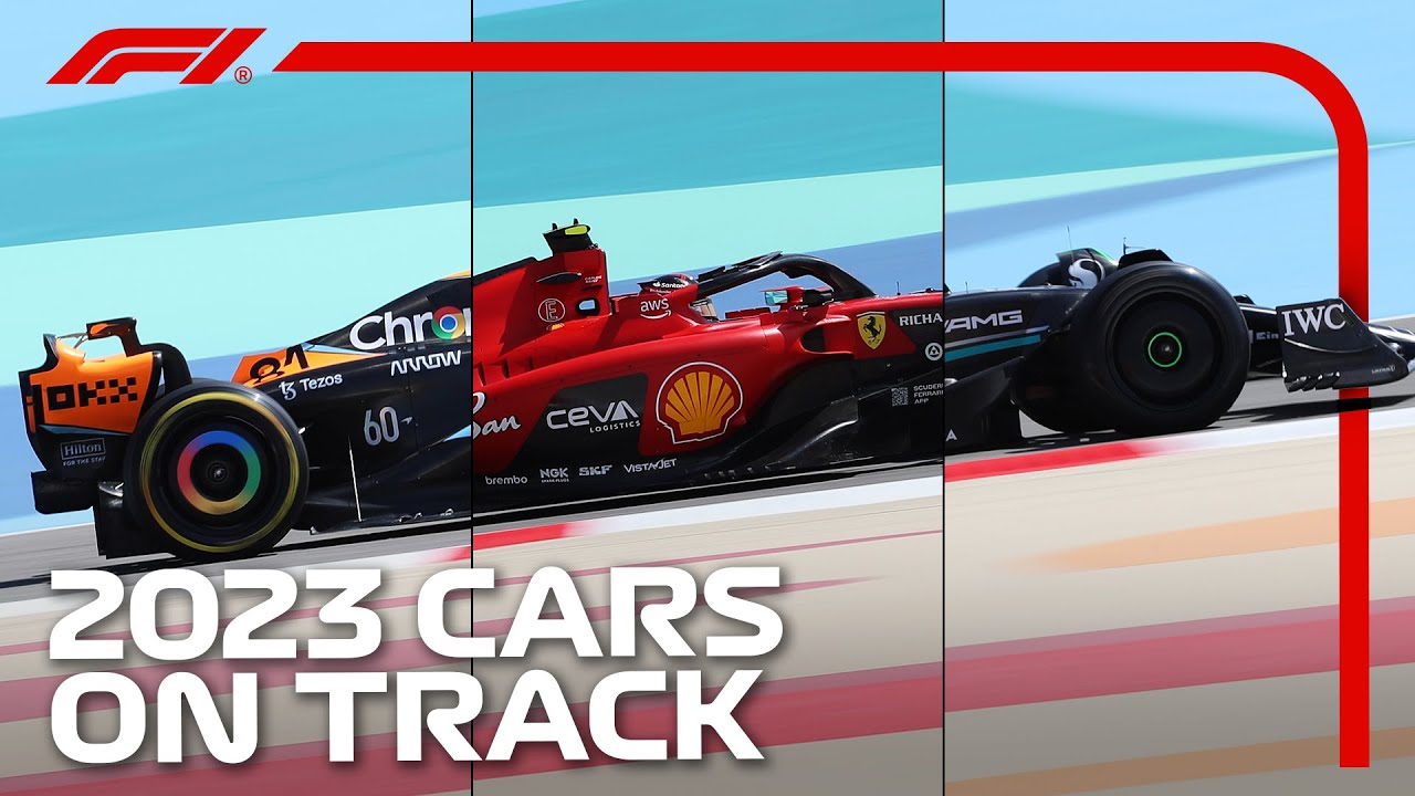
All the cars on track in real conditions:

My concern about Alfa Romeo cars was warranted… you can’t tell the driver number from all the other white markings down the nose of the car. Even if you know where to look, you can’t read it.

Weirdly, Ferrari’s driver numbers are also hard to read, mostly due to the numbers’ location too high up the nose, so not presenting at a good angle.

BUT THE WORSE OOOPSIES:

From the front, the Haas looks like a white car with a red rear wing.

From the front, the Alpha Tauri looks like a white car with a red rear wing.

When they both appeared on track together in this video, the only reason I didn’t think there were two Haas cars running together is that teams can only run one car during testing.

I really hope the F1 managers tell them to change the designs, or else this is going to get very tedious throughout the year.

I have now watched a couple of short recaps of pre-season testing and I’ve been especially interested in the variety of body design concepts and if there appears to be any trends amongst variety and similarity present on this year’s cars. For example, it is pretty amazing to me that there can be the extreme difference in sidepod design between, for example, Ferrari and Mercedes, and both have the potential to be competitive / co-exist in the same year of F1 rules. Another thing that stands out are both front wing and especially rear wing shapes.

Then I got to work where we are increasingly hearing about how companies are leveraging Machine Learning in various industries and it got me wondering if F1 teams are or will soon be leveraging AI to at least generate and test aerodynamic components. Of course physics dictates what the limits of possibilities are, but since each car has some fundamental aerodynamic philosophies they are built up from and since there can be complex interactions between various bits and components along the car I could imagine the potential for value in utilizing a generative approach to experimenting with tweaks to those components. Just give the AI GAN algorithm the rules of physics, the properties of the material (carbon fiber strength, mostly), manufacturing capabilities (minimum radius of bends, minimum thickness, attachment points, etc…), and the current F1 rules and have it get to work both for individual components as well as looking more holistically how adding a component near the front of the car affects airflow further back and improving or diminishing the effectiveness of other components.

Of course, this is much easier said that done (can you automate CFD simulations and programmatically measure the effectiveness?), but seems like a likely and lucrative design approach in car design. Also, a human will need to supervise or at least review any promising results the algorithm returns and do further testing to make sure all factors have been considered, so I’m not talking about just let an AI design a car and put it on track with no human intellectual involvement.

The new science behind injury recovery is getting scarily good results. I saw this last year when a mountain biker broker her collar bone and was back racing four weeks later. Now Lance Stoll breaks four bones and is back racing 12 days later!

Some good X-ray images and rehab footage in this reel:

189K Likes, 3,446 Comments - Lance Stroll (@lance_stroll) on Instagram: "I want to take a moment today to reflect on the last couple weeks, and share my story with you gu..."

https://www.instagram.com/reel/CpfjpQPrdJU/?igshid=YmMyMTA2M2Y=

So you’re telling me the pro athletes who are returning to play with shockingly short recovery times after injury are actually healed and not just using PEDs and painkillers?

I honestly don’t know enough about this topic to gauge your tone, to know if you’re impressed or dismissive or positive or negative.

Over the past decade-ish, pro athletes are recovering from injury faster than ever. It’s very rare to see athletes with all but the most severe injuries out for more than a few games or a few weeks. Whereas in the past, people would be done for the season.

You look at someone like Bo Jackson who may have been the greatest overall athlete in history, but had a career that was extremely short due to injury. If he had just been born later, that sure would have been a sight to see. He might not have messed up his hip to begin with. Look at how people like Tiger Woods and Nadal keep finding their way back, even their performance is somewhat diminished.

I’ve always had this assumption that when an athlete came back suspiciously quickly from an injury that it was because they were using some sort of illicit substances to speed up the healing process and/or gritting their way through it with painkillers. For example it’s been well reported that Toradol is overused in the NHL.

It’s just that reporters are, understandably, reluctant to accuse or ask any athletes about this. They’ll never go to an athlete who comes back quickly from injury and be like “Hey, did you really heal that quickly? You’re hot hiding anything?” So there’s reliable reporting that it’s a thing, but no names get named.

But seeing this, clearly it’s also partially for real. Medicine is just that much better than it was, and people can get back into good enough shape to compete again before father time ages them out of sports.

I suppose there might also be a difference in the level of injury due to technique, equipment, etc too, which may limit the severity of injury that’s occuring. Like, look at Goalies in hockey from before they made helmets mandatory, and after - it’s a pretty stark difference when you’re not just catching slapshots with your bare cheekbone or jaw, even if they might still get injuries on occasion.

As far as I can tell, medical knowledge and procedures keep getting better. A lot of it seems to be down to the athletes keeping up their physical conditioning from the earliest opportunity.

The old way was after breaking a bone: put a cast on to stop the bones from moving, rest for weeks until the bone is set, then start gentle training to make sure it doesn’t hurt, then ramp up the training to regain all the muscle mass lost while you couldn’t move your limb due to the cast and resting period.

More modern approach: put in metal pins to hold the bones in a fixed position instead of using a cast, keep training the surrounding muscles to give more support, pay physical trainers with specific knowledge so you don’t overdo it, have a nutritionist plan your meals with all the right chemicals for bone growth, plus maybe ultrasound and other maybe-pseudoscience techniques, because they probably won’t hurt and might have some benefits.

And yeah, maybe some high quality pain killers.

Thankfully I’ve not experienced either course of action because the only bones I’ve broken have been relatively minor, like my ribs (twice), my nose (I put it back in place myself) and some toes (I wore a ski boot on my right foot and carried on as normal).